Reimagining a jeweler's online presence
View live site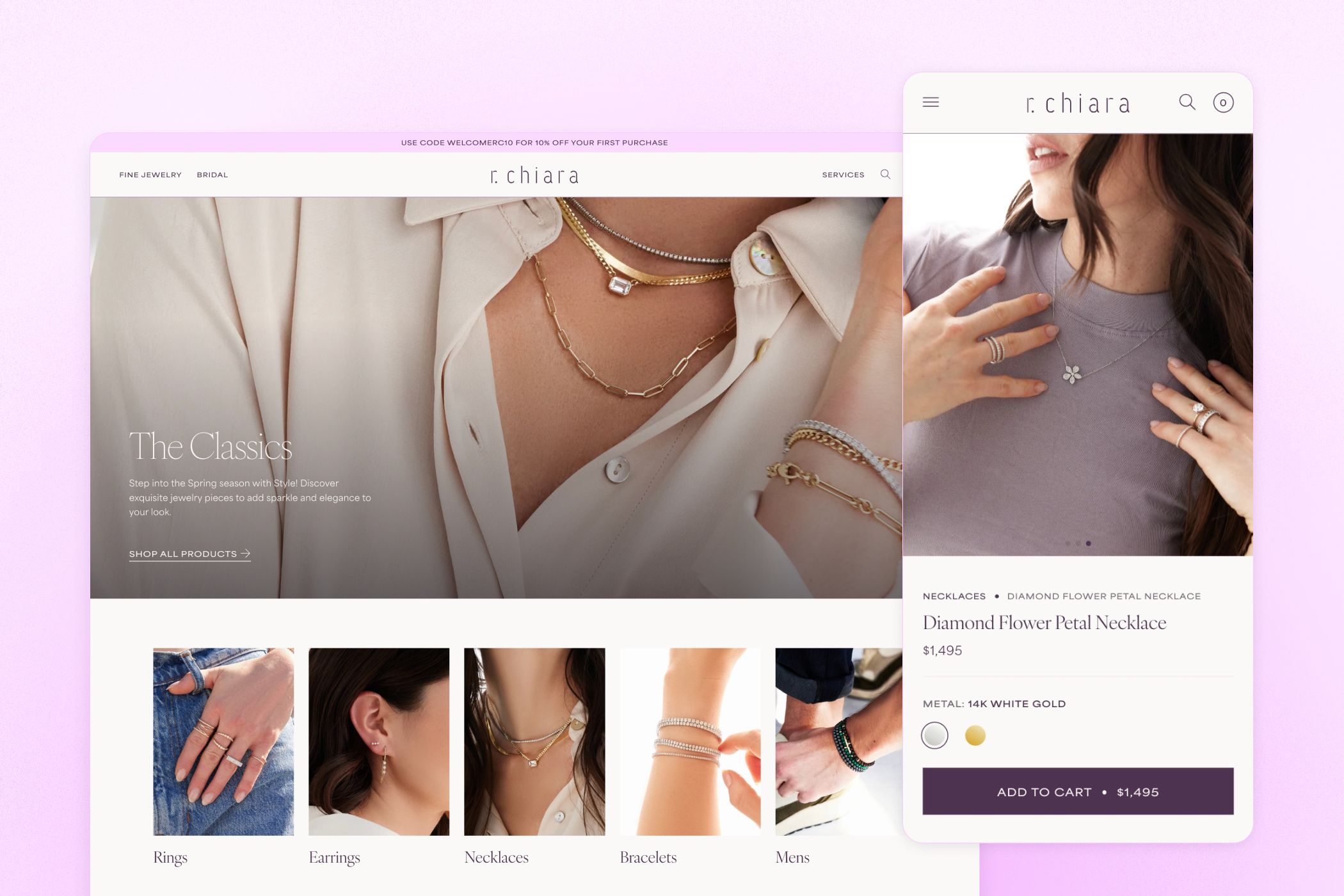
The Challenge
As a boutique fine jewelry brand based in the heart of NYC’s famous diamond district, r. chiara needed a refreshed website that better showcased their uniquely handcrafted pieces while also providing an agile backend framework to facilitate quick and seamless promotional changeovers throughout the year.
Discovered Opportunities
After conducting a thorough audit of the existing site, three primary opportunities to help make the site better meet the client’s business needs were highlighted:
- Crafting a cohesive design language: The site’s design was fragmented, with no consistent visual or thematic elements to tie the brand together. This lack of coherence left the brand feeling unclear and disconnected.
- Elevating the shopping experience: The user experience of the site lacked a clear understanding of the product and the intricacies of shopping for jewelry online — a poor search experience, the lack of controls to filter products and a simplistic product detail page culminated in a frustrating shopping experience.
- Supercharging the CMS: The theme was overly rigid in its customization capabilities — limited settings for each module in the backend meant that updating the site to align with promotional or seasonal changeovers was often too time-consuming or altogether impossible.
Crafting a Cohesive Design Language
The original site was missing a distinct design language and brand voice, which left it feeling unfinished and devoid of character. As a part of the redesign, the client sought to establish a design style that would convey the quality and uniqueness of their pieces while still allowing the beauty of their jewelry to take center stage.
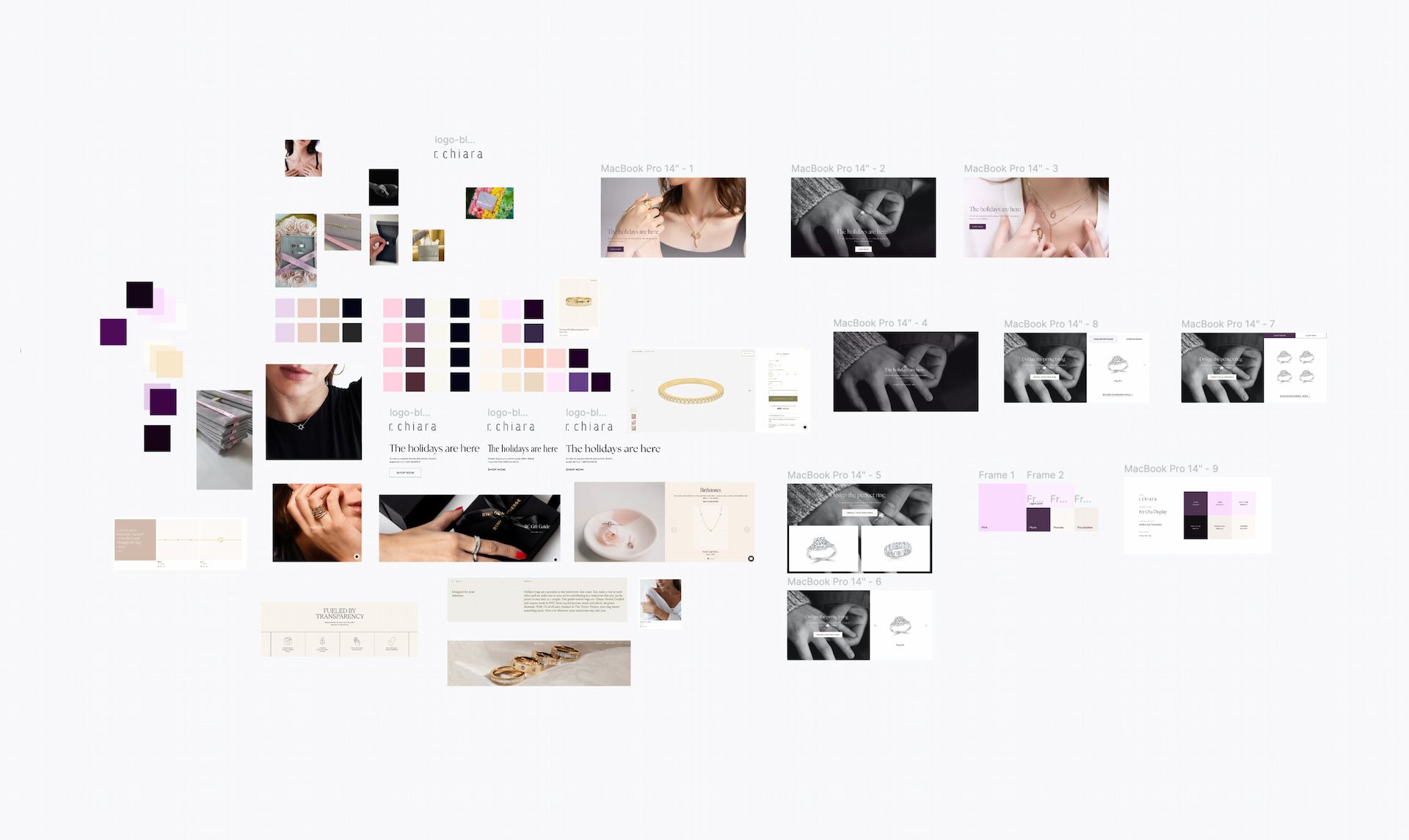
We started by gathering inspiration from a variety of sources, including the client’s reference sites, to assemble a moodboard from which we could derive a distinct design direction.
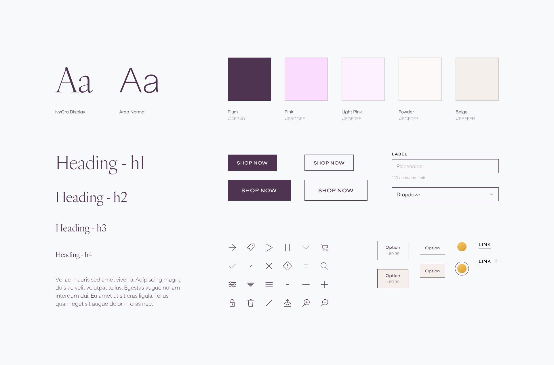
The end result was a design system that echoed the quality and elegance of the brand, featuring a clean and sophisticated serif font for headings, and accented by various shades of the boutique’s signature pink, plum and powder colors.
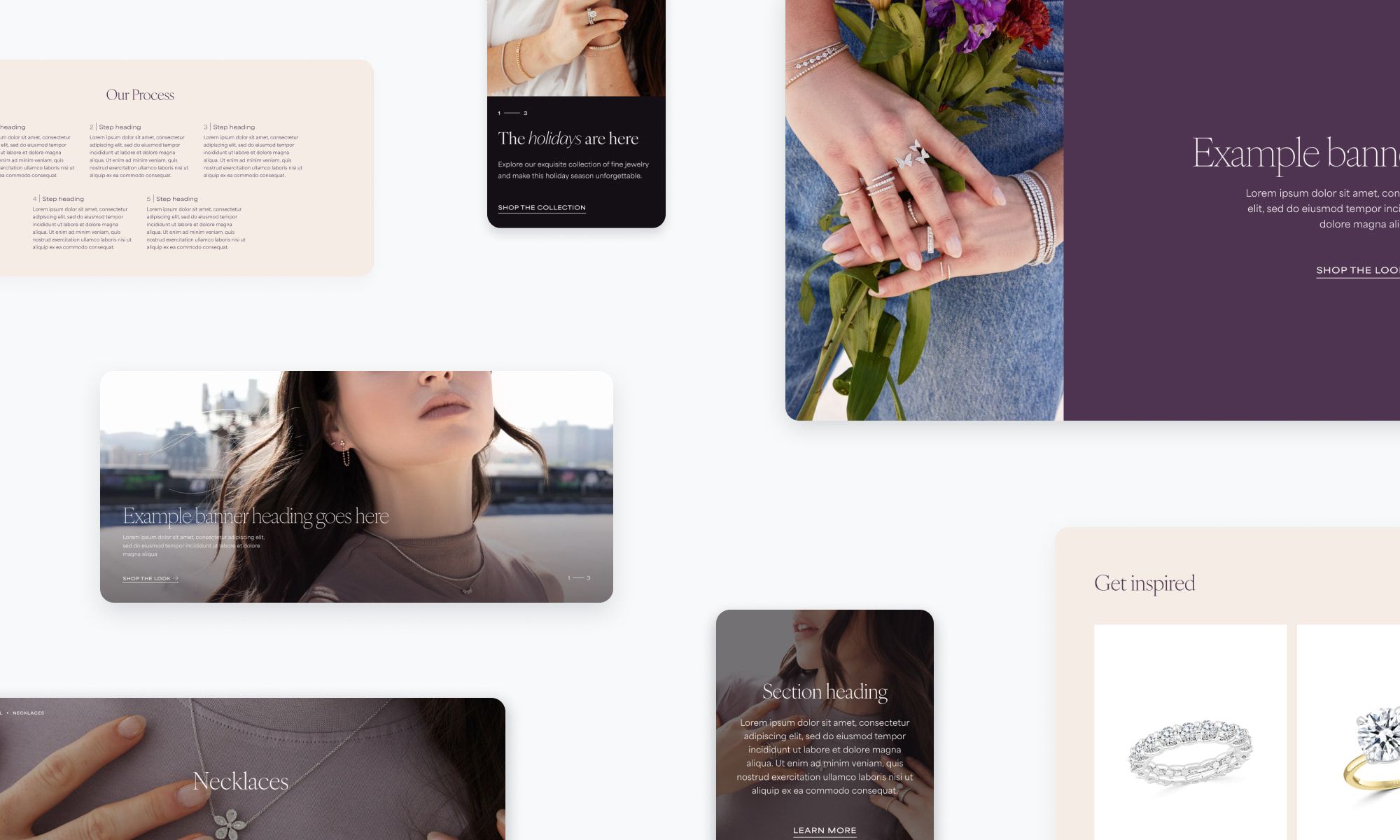
With the help of the new design system, we composed a suite of visually consistent modules the client could use out-of-the-box throughout the site in a variety of combinations. This gave nearly limitless possibilities for various promotions or releases throughout the season.
Elevating the Shopping Experience
One of the major shortcomings of the original site was its search experience. Finding a jewelry piece required too many steps and lacked modern eCommerce features like search suggestions and predictive results. In designing the updated search experience, our goal was to provide shoppers with various pathways to discover the perfect piece—whether they’re searching for a specific ring, exploring a collection for inspiration, or looking to inquire about custom bridal pieces.
The new predictive search feature in action
Product filtering and sorting on the previous site were notably limited, providing just a handful of options. Our redesigned experience gave shoppers more control, enabling them to easily filter products by price range and metal type, ensuring they could find exactly what they were looking for.
Shoppers can filter by price, metal, gemstone and more
A key highlight of our redesign was the transformation of the product detail page, where we aimed to enhance the way shoppers interact with and appreciate the jewelry. The client wanted to include high-resolution videos to showcase their jewelry on the product pages, along with the option to zoom in on images. Our solution was a comprehensive media gallery that allowed shoppers to explore each piece in extra-fine detail.
An enhanced shopping experience on the main product page
Supercharging the CMS
A crucial component of the redesign was ensuring the client had control over the content and layout via Shopify’s content management system. The previous theme was purchased through Shopify’s theme market, but it lacked a lot of the settings that a fully bespoke theme could offer.
An example of just one of these enhanced settings was a global color scheme library. To help differentiate sections on each page and break up large areas of white space, nearly every module included a color_scheme setting to change the foreground, background and accent colors. They could even create their own color schemes if they desired.
This gave the client the freedom to test out different looks and color combinations across the site without having to go through our development team.
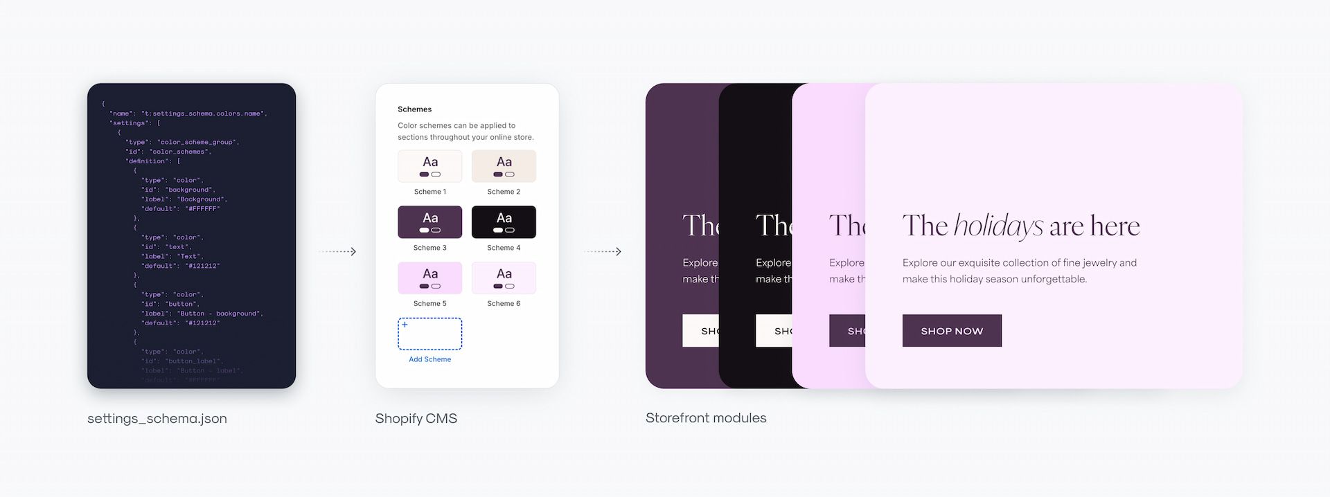
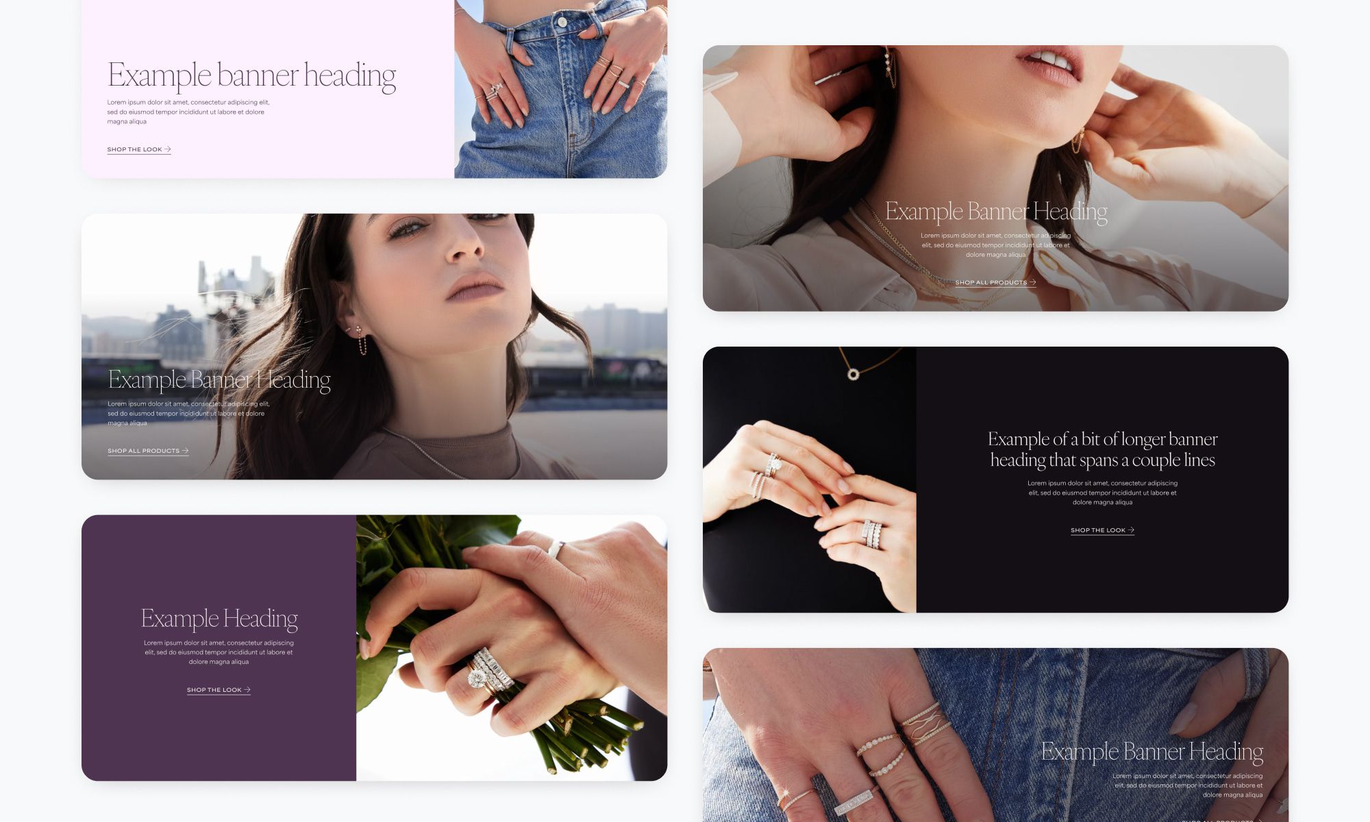
Along the same lines, we intentionally designed the content modules to support different layouts that gave the client a variety of options to display copy and media across the site.
The hero module, for example, came pre-packaged with a selection of layouts that could accomodate images with varying focal points. Given that one of the client’s chief complaints with the old theme was that the text in the hero section was often blocking important parts of the image, it was imperative that we developed a toolkit that remedied these recurring issues.
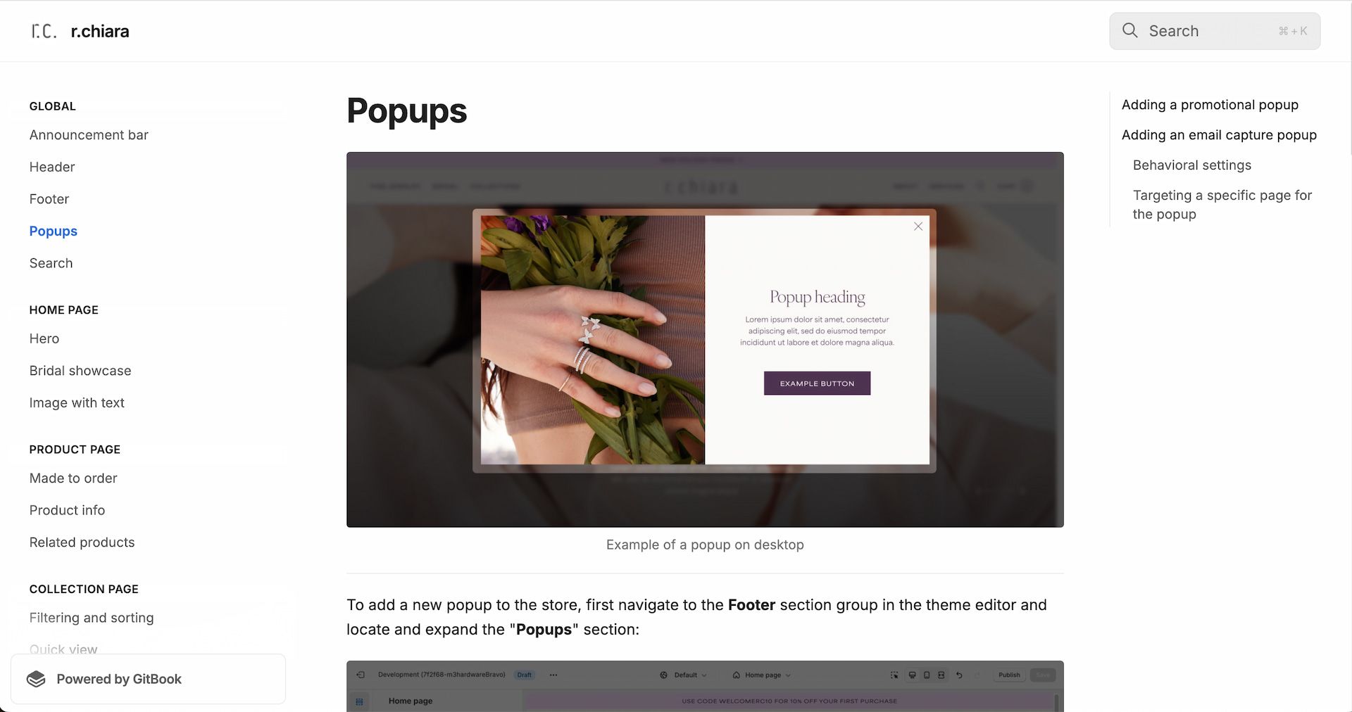
To keep everything regarding the site’s customization capabilities organized and easily accessible for the client, we set aside ample time to create documentations for each module and it’s various settings.
Outcomes
After two months of work, we shipped a fully customized Shopify theme that was built on the foundations of cohesive design, an elevated shopping experience, and a future-proof content management setup. Not only did we completely revamp the store, but we also developed a set of docs that the client could easily refer to when making changes to the store post-launch. This ultimately reduced the frequency of needing to get in touch with our development team for the more trivial updates across the site, giving the power of content back to the client.
Two months after launching the new theme, we were pleased to see improvements in three key metrics compared to the last two months with the old theme:
- Total Sales
- 49%
- Avg Order Value
- 88%
- Returning Customer Rate
- 42%
Takeaways
Above all, this project was a prime example of how crucial a proper CMS is to a successful website redesign. One the client’s biggest issues with the old site was the lack of control they had over different aspects of the store and its content. Building around a more robust content management system challenged a lot of our initial design choices, but ultimately helped us develop a storefront that was built to handle a variety of configurations over time. It was a valuable lesson in putting both the user and client experience at the forefront of the design process.