Modernizing an iconic non-profit's web presence
View live site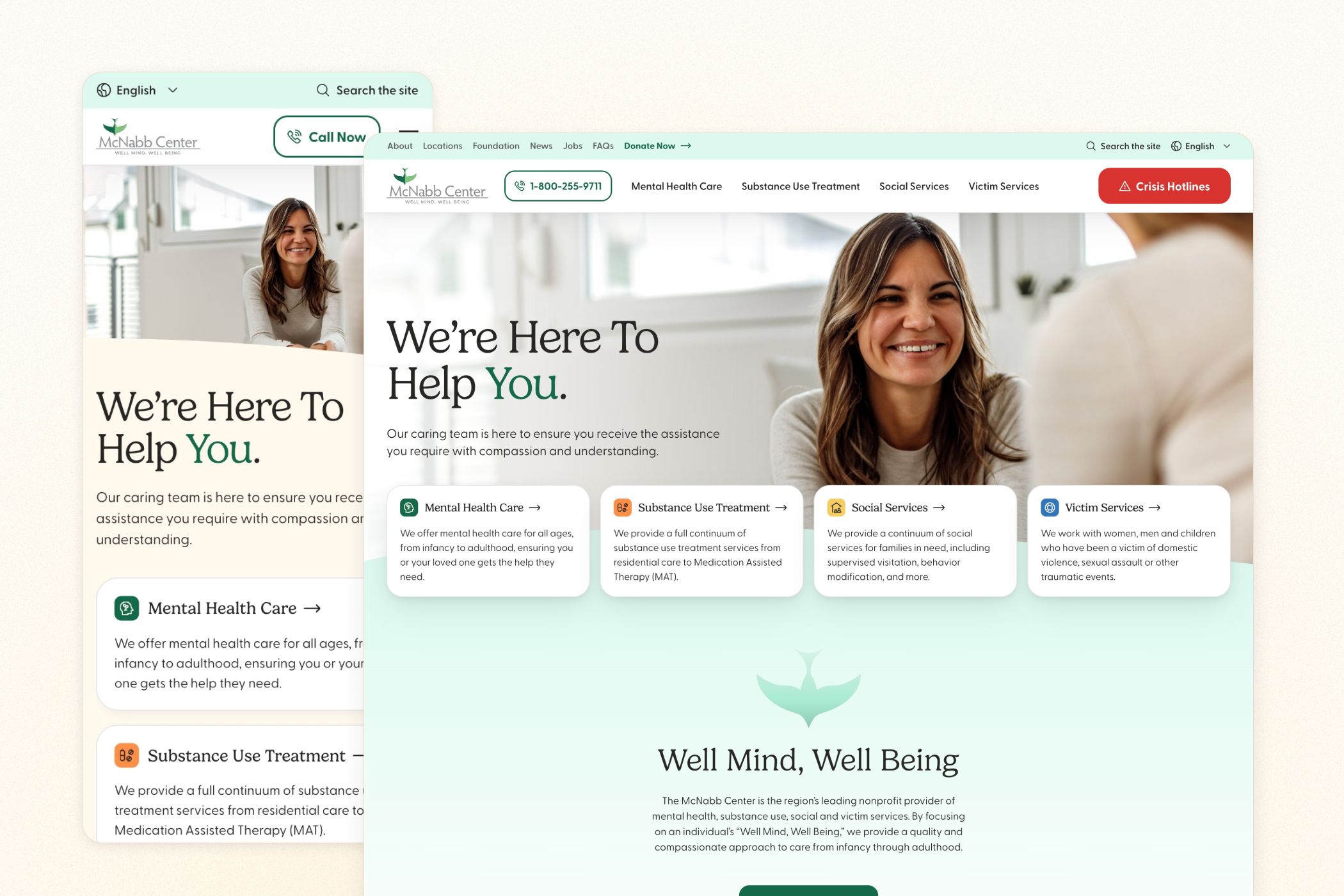
The Challenge
Known throughout the East Tennessee region for their decades of providing quality mental health and social services to under-serviced communities, The McNabb Center was unfortunately saddled with a website that lacked the features and professionalism of an organization that serves nearly 60,000 people each year. For their updated website, they expressed the need to bring a more professional feel to their organization, while ensuring that their service information was clearly organized and easily accessible.
Discovered Opportunities
After conducting a thorough audit of the existing site, three primary opportunities to help make the site better meet the client’s business needs were highlighted:
- Creating a design language that distinguishes service areas: With four overarching categories of care, distinguishing each focus area and its various subcategories using both colors and iconography would help to give the site a clear and intuitive organizational logic.
- Developing a more robust search experience: With so many different services offered across multiple categories, having an easily accessible and intuitive search feature that could be utilized from anywhere on the site was a necessity.
- Making the crisis hotlines easier to access: The organization’s crisis hotlines are a crucial resource for those in desperate and immediate need of assistance. Making these hotlines easy to reach and utilize was one of the focal points of the design stage.
Creating A Design Language That Distinguishes Service Areas
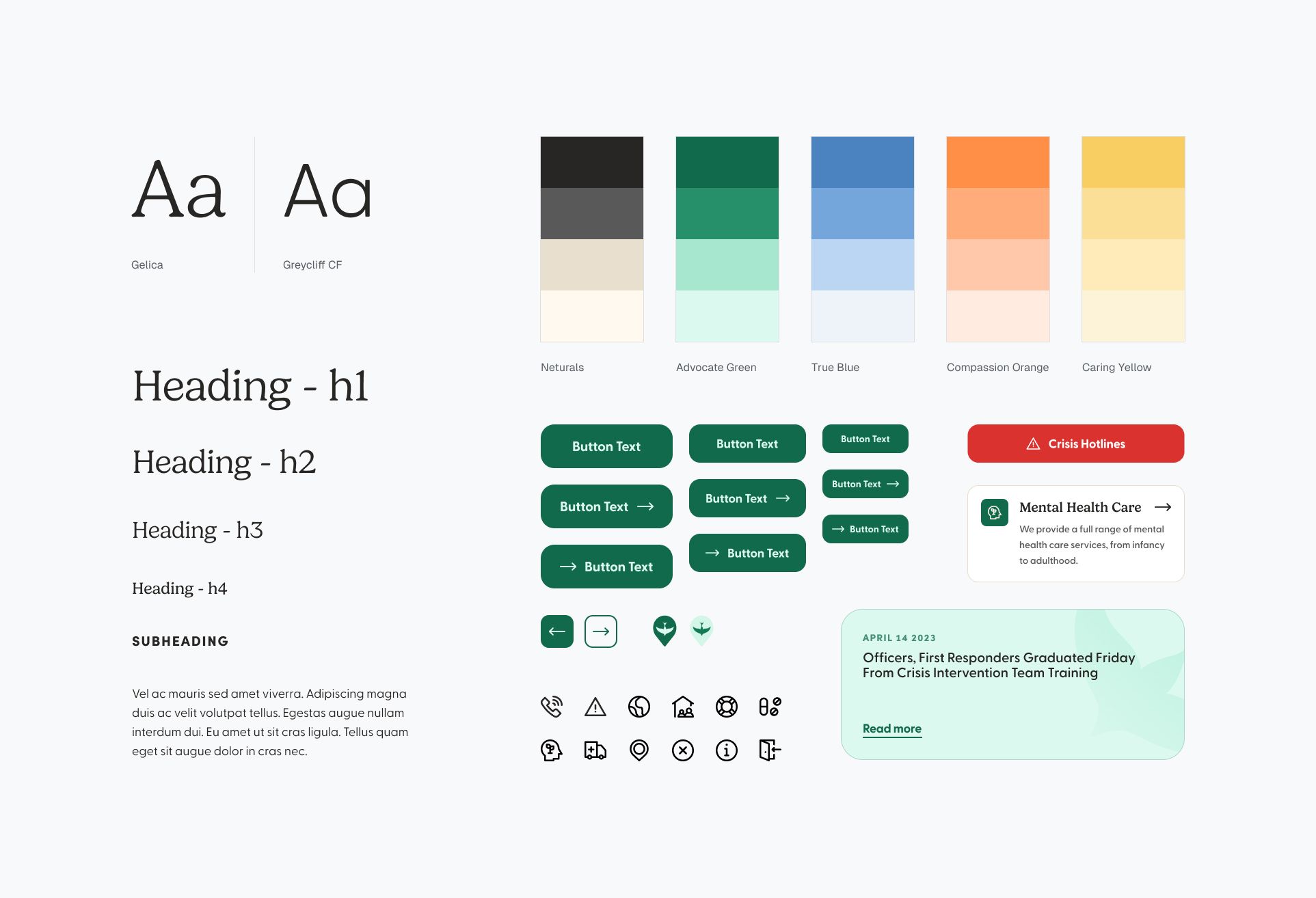
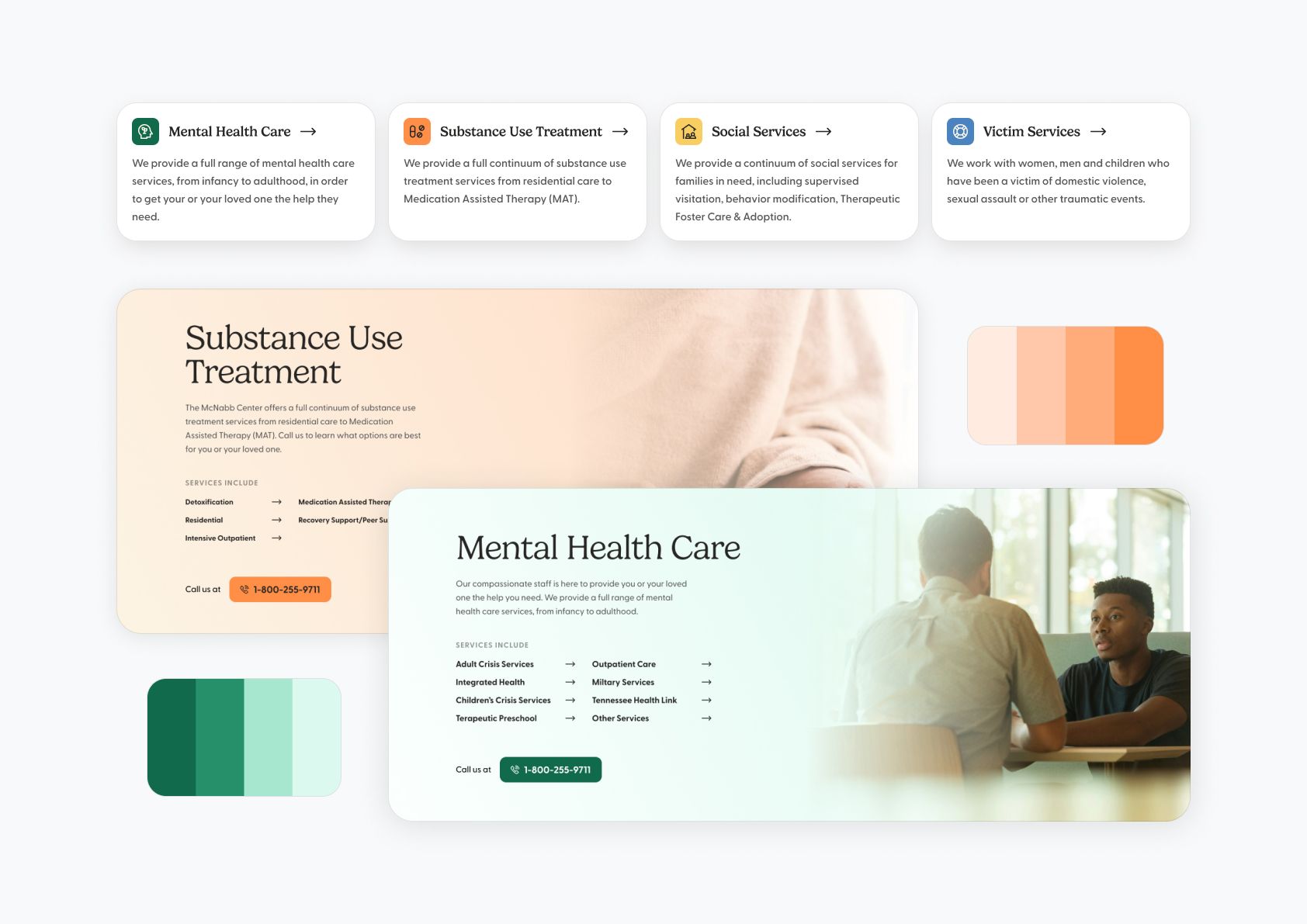
During our design discovery phase, we determined a major focal point was how the organization delineates between their different service areas. For context, the Center offers services that fall under the umbrella of one of four categories: Mental Health, Substance Use Treatment, Social Services, and Victim Services. Prior to our involvement, the Center had already made a habit of distinguishing their services with unique colors, we simply tweaked their original color schemes to better complement their iconic brand colors, while also introducing iconography to accomodate users with color blindness.
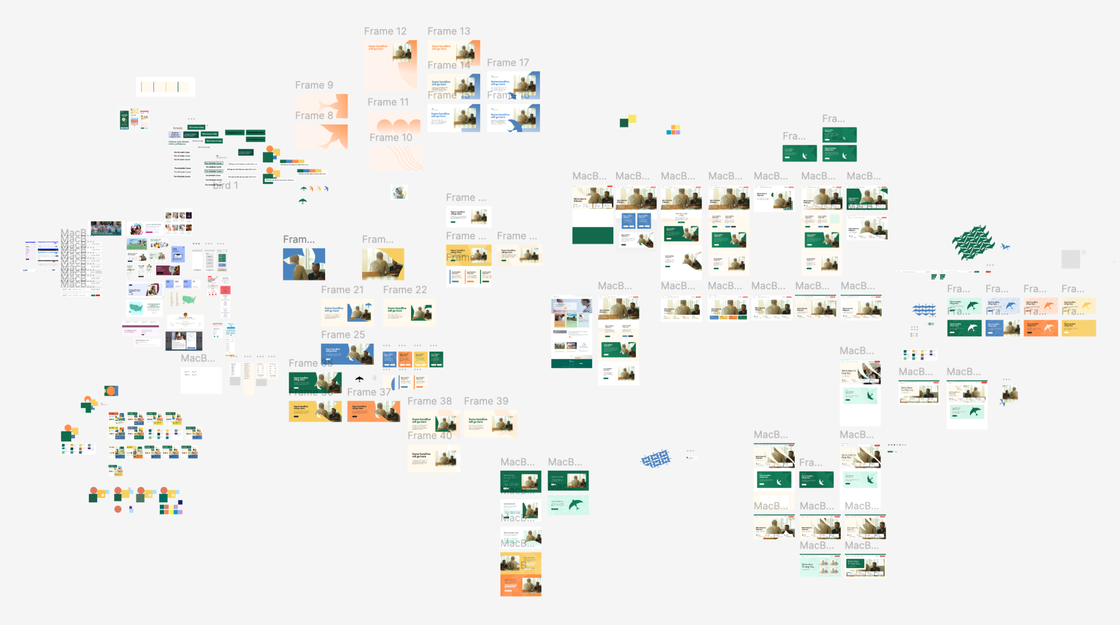
Our exploration culminated in a design system that exemplified the organization’s approachable and compassionate nature while injecting moments of intrigue throught it’s bright color scheme.
The design scheme’s colors played an especially important role in the websites composition, as each color denoted a specific service category, making it easier and more intuitive for visitors to find the specific type of care they’re looking for. Unique iconography was also used alongside the colors to accomodate users who may have trouble distinguishing certain colors.
Developing A More Robust Search Experience
One of the most glaring shortcomings of the organization’s previous website was its limited search capabilities. Trying to find a specific service area or physical location often required typing the query into the search bar, hitting “search” and sifting through multiple pages of results, many of which included information that wasn’t even related to the intial query. Our goal with the improved search UX was to ensure visitors could find the exact info they came looking for without even having to leave whatever page they were on. Moreover, finding a more clever way to distinguish content types (pages, locations, numbers, etc.) in the search results would make navigation exceptionally easier.
Predictive search makes finding a page, hotline or service quick and easy.
Our predictive search feature eliminated the need to even navigate to a standalone search page, instead giving the visitor everything they needed to quickly locate a specific page, crisis hotline, story or location.
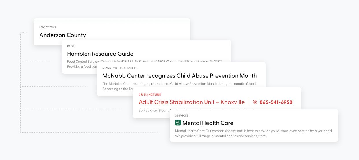
One of the primary reasons that performing a search on the previous website was such a frustrating and confusing experience was that the results did not indicate their purpose or categorization. Pages that contained company news articles were obviously vastly different in their purpose and target audience than pages that listed the organization’s services, so it was important to distinguish these differences in the results themselves. Our search result taxonomy made it clear which category each item fell under. Moreover, including search results that weren’t actual pages on the site but still could be considered relevant information, like Crisis Hotlines, made the search experience even more useful than before.
Making Crisis Hotlines Easier To Access
A crucial part of the services that the Center offers is a directory of hotlines that can be used by visitors in mental, physical or emotional distress in order to get immediate help. Unfortunately, on the previous site the process of accessing and utilizing these hotline numbers was a notoriously buggy experience and was not organized in a way that clearly identified each hotline’s intended use. We set out to make the experience of calling a hotline as seamless as possible and to ensure each hotline’s number and any relevant info was immediately apparent to the user.
How the crisis hotlines are accessed on the site
Clicking the crisis hotlines button on the previous site shifted the entire page down to show a list of the hotline numbers that was poorly orgnanized and lacked the clarity that was needed in a situation where a visitor might be in some sort of distress and not able to easily parse information. Our new implementation utilized a focus-locked modal that listed the hotline names, their revelant info, and their phone number in a logical manner. Based on our research of similar sites, we also felt that it was prudent to include an option at the bottom of the modal to quickly exit the site in case the visitor felt they were in danger of someone happening upon them browsing the site.
Takeaways
Overall, the work we did for The McNabb Center was some of the proudest work of my career, not only because we were teaming up with a local non-profit that was known for its dedication to improving the lives of East Tennessee residents, but also because it truly felt as though we had furthered their mission by making their website easier to navigate and utilize. Even making tweaks to what could be seen as less important parts of a website, such as its search functionality or its color scheme, could make a big difference in a visitor’s journey.
Acknowledgements
- Avery Mathews - Co-developer
- Zayadur Khan - Co-developer